Lafayette Shuttle
A mobile app that makes booking and riding the Lafayette Shuttle actually usable, for Purdue students who just need to get to the airport without the stress.
Context
Getting from Purdue's campus in West Lafayette, Indiana to an airport is not simple. Chicago O'Hare is 3.5 hours away. Indianapolis is an hour. The Lafayette Shuttle runs routes to both, but booking it was its own ordeal. The website was outdated and glitchy. Schedules were hard to find. Confirmation systems were unreliable. You never really knew if your seat was locked in. There were three different shuttle services covering the routes, and each had its own reliability problems. Students made it work, but only through a lot of adjusting.
I used this shuttle regularly as a student. I knew the frustration firsthand and wanted to fix it. This was my solo capstone project, approved and presented at Purdue as part of Studio 5. I interviewed 18+ students and staff, ran my own research, designed from scratch, and presented with a poster at the final milestone.
The problem
Purdue students rely on shuttle services to get to and from the airport, especially during breaks when demand spikes and seats fill up fast. Most of them found it genuinely frustrating to book.
The problems were consistent across interviews: multiple outdated websites that were hard to navigate, a booking platform that caused confusion and drop-off, no reliable reservation confirmation, no real-time tracking, and no single app that pulled everything together. Students were booking through a system that felt like it was built for a different era.

Research
I interviewed 18+ Purdue students and staff who used shuttle services regularly. I ran heuristic evaluations of existing shuttle websites and looked at how major travel hubs like O'Hare and Indianapolis handled booking and notifications.
Four themes came out of the research:
User experience problems. Multiple fragmented websites made it hard to find the right shuttle, the right time, and complete a booking without something going wrong.
User needs. Students needed a more accessible, visually clear service with a reliable reservation and notification system.
Identified pain points. No quick and easy access to shuttle information, no real-time updates, no clear booking options.
Opportunity. A clear case for a single unified app that handled booking, tracking, and reservation management in one place.
Design concept
Before moving to final screens I mapped out the core flow: Homepage, Booking, Reservation, Checkout. Each step needed to be simpler than what existed, with fewer decisions per screen and clearer feedback at every point.

Key challenges identified during this phase:
Logo representation. The existing Purdue logo felt mainstreamed and outdated. A refreshed brand identity would make the service feel more trustworthy.
Homepage information. Displaying passenger counts and connecting to schedule needed to feel lightweight, not cluttered.
Navigation clarity. The nav bar needed to be immediately understandable without tags that created extra friction.
Checkout page. Focused solely on personal details and payment, nothing extra.
Tracking method. QR codes were preferable to hyperlinks for tracking shuttle stops, making it easy for users to pull up their boarding pass quickly.
Final design
Main Page

Refreshed brand identity with a cleaner logo and homepage layout.
Menu and Homepage

The entry point. Clean navigation with quick access to booking and account.
Selecting Pickup and Dropoff

Students enter their origin and destination from common campus pickup points.
Scheduling the Shuttle

After setting locations, students pick their departure time from available slots.
Viewing Available Shuttles

A clear list of available shuttles with departure times, seat availability, and pricing.
Booking and Payment
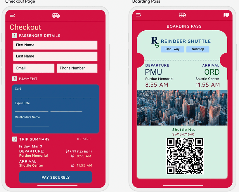
Passenger details and payment in one focused flow. No unnecessary steps.
Boarding Pass and Reservation
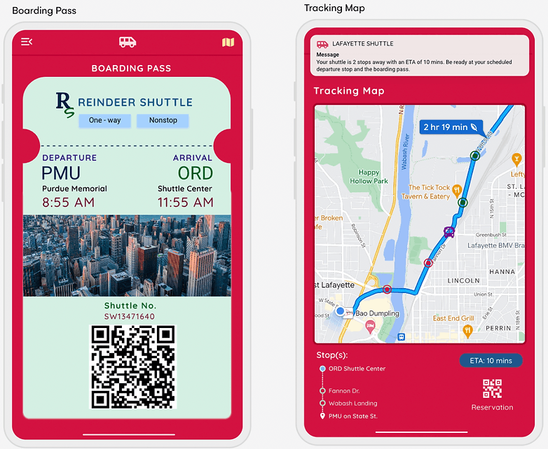
A QR code boarding pass with travel day map and push notifications.
Tracking and Boarding

Real-time shuttle tracking and the boarding pass ticket, accessible in one tap.
What I learned
This was the first project I took from a personal frustration all the way to a presented, polished design. The research confirmed what I already suspected from experience, but it also surfaced things I would not have caught on my own. Students were not just annoyed by the website. They had genuinely stopped trusting the confirmation system. They were screenshotting emails and texting friends to double-check their reservations. That level of distrust shaped the entire emphasis on reliable confirmation, QR code boarding passes, and real-time tracking in the final design.
Designing solo meant every decision was mine to own and defend. Presenting milestones throughout the semester kept me honest about whether the work was actually solving the problem or just looking good.